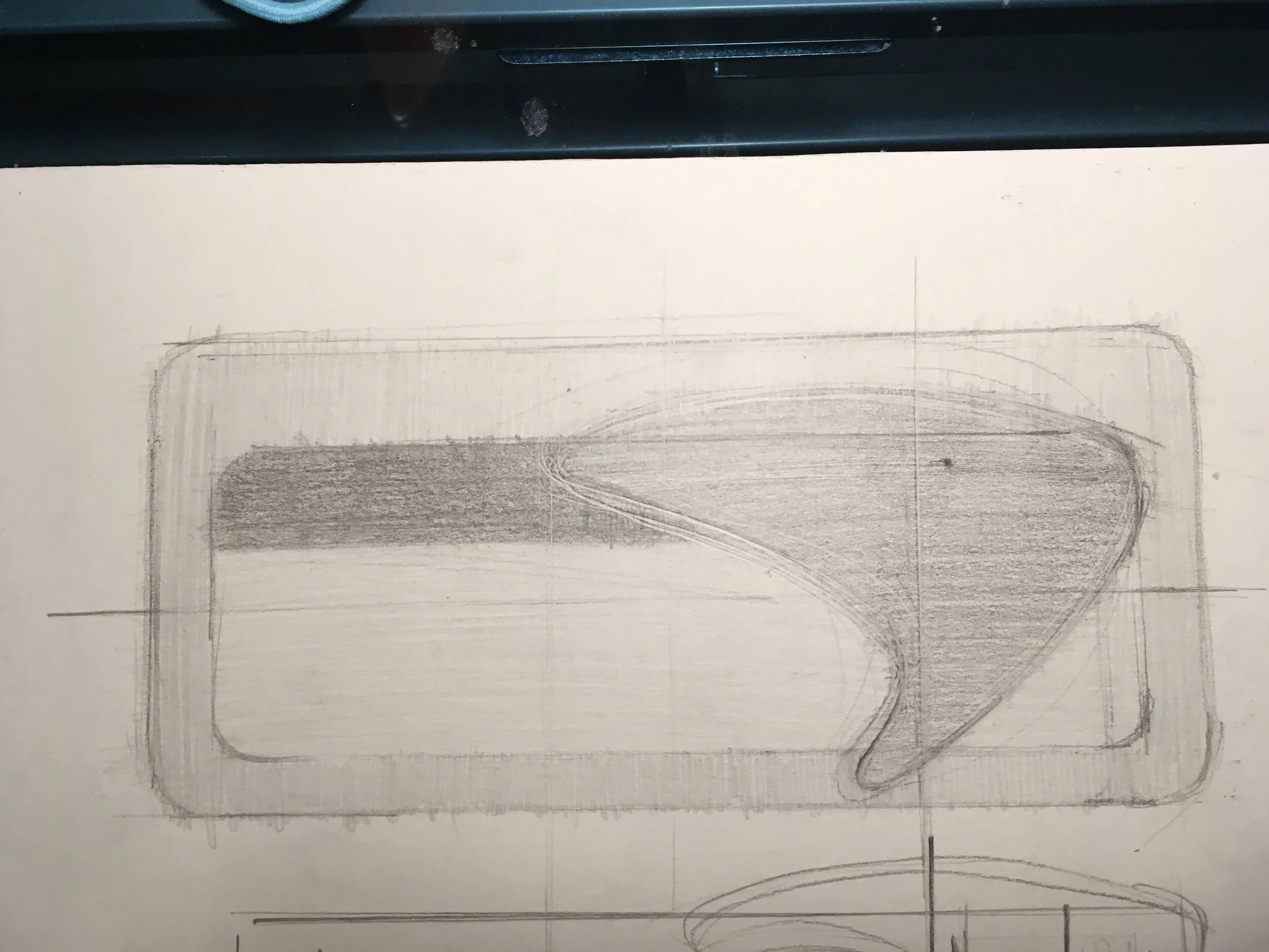
Airports are stressful environments. Badly designed boarding passes are annoying. The boarding pass is essential for air travel but when badly designed, it can be stressful. I wanted to solve not only the aesthetics of the boarding pass, but the layout of information in order of importance.
CURRENT DESIGN
The ticket has at least two users; both the traveler, who uses it as a reference, and also any TSA agent or airline employee that might need to inspect it. So, Ive but the agent side in a horizontal position, so that would be easier.
Following questions were the most important ones;
What time do I fly?
What gate do I leave from?
Which boarding group am I in?
What is my seat number?
Branding
The two key brand assets used by an airline are their color and logo. I tought blue color palette is a perfect fit for an airline brand. So,that It would represent the sky.
A small touch for the logo by curving the lines, simplified it. So, It looks more fresh.


