A logo design that combines of simple shapes with an understanding of perceptionHangMan
HangMan - Ambigram
Hangman - Process
HangMan Ref
HangMan Ref
HangMan Ref

A logo design that combines of simple shapes with an understanding of perception
HangMan

HangMan - Ambigram

Hangman - Process

HangMan Ref

HangMan Ref

HangMan Ref


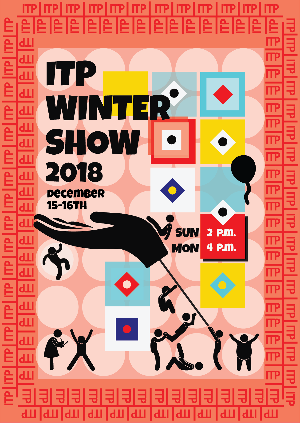
I’ve edited the winter show postcard by adding address and NYU logo with NYU colors.

Version1

Version2


I’ve created compositions by using pure shape forms, abstract shapes. My color palette composed of 5 distinct colors.

Color Palette


Airports are stressful environments. Badly designed boarding passes are annoying. The boarding pass is essential for air travel but when badly designed, it can be stressful. I wanted to solve not only the aesthetics of the boarding pass, but the layout of information in order of importance.

The ticket has at least two users; both the traveler, who uses it as a reference, and also any TSA agent or airline employee that might need to inspect it. So, Ive but the agent side in a horizontal position, so that would be easier.
Following questions were the most important ones;
What time do I fly?
What gate do I leave from?
Which boarding group am I in?
What is my seat number?

Branding
The two key brand assets used by an airline are their color and logo. I tought blue color palette is a perfect fit for an airline brand. So,that It would represent the sky.
A small touch for the logo by curving the lines, simplified it. So, It looks more fresh.

I would like to analyze Paula Cher’s most recognized piece “Bring in ’Da Noise, Bring in ’Da Funk”. I’ts a poster from 1994.

BRING IN ‘DA NOISE, BRING IN ‘DA FUNK
PAULA CHER
Paula Scher was the first designer to create a new identity and promotional graphics system for The Public Theater, a program that become the turning point of identity in designs that influence much of the graphic design created for theatrical promotion and for cultural institutions in general.
Based on the challenge to raise public awareness and attendance at the Public Theater along with trying to appeal to a more diverse crowd.
Poster’s graphic language reflects street typography and graffiti-like juxtapostion. The wood typefaces used throughout The Public Theater’s identity.
Billboard is formed from silhouetted photographs and bright flat and sharply contrast colors. Primary color scheme is yellow and black. The colors are limited to two or three while highlighted the play’s title and theater logo that surrounded the tap artist in a typographical be-bop. The character has been scaled up dramatically, drawing attention to him first
The design was to appeal to a broad audience from the inner cities to the outer boroughs, especially those who hadn’t been attracted to theater.
She used typography to make the poster look “noisy” to reflect the experience of the show. So, The most striking element is typography.
The hierarchy of information is established through the text using size, weight. Repetition utilizes through consistent colour palette and consistent typography use.
Various lines used aren’t for the purpose of help to lead the eyes. They are used for design randomness. They create stylistic disorder Instead of trying to achieve perfect symmetry some texts are used in diagonal direction.
This style of typographic art became the identity of the small theater, which is “based on being extremely loud, visible, and urban.”

Color Palette
