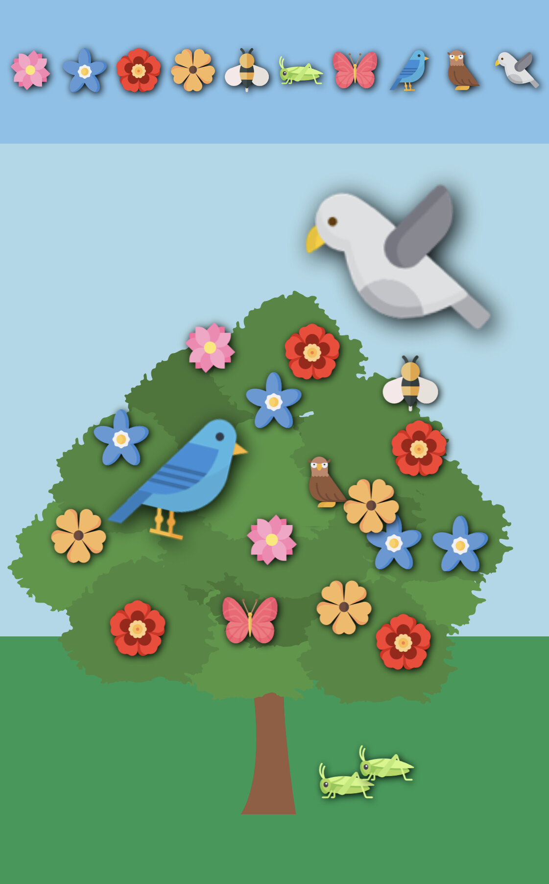
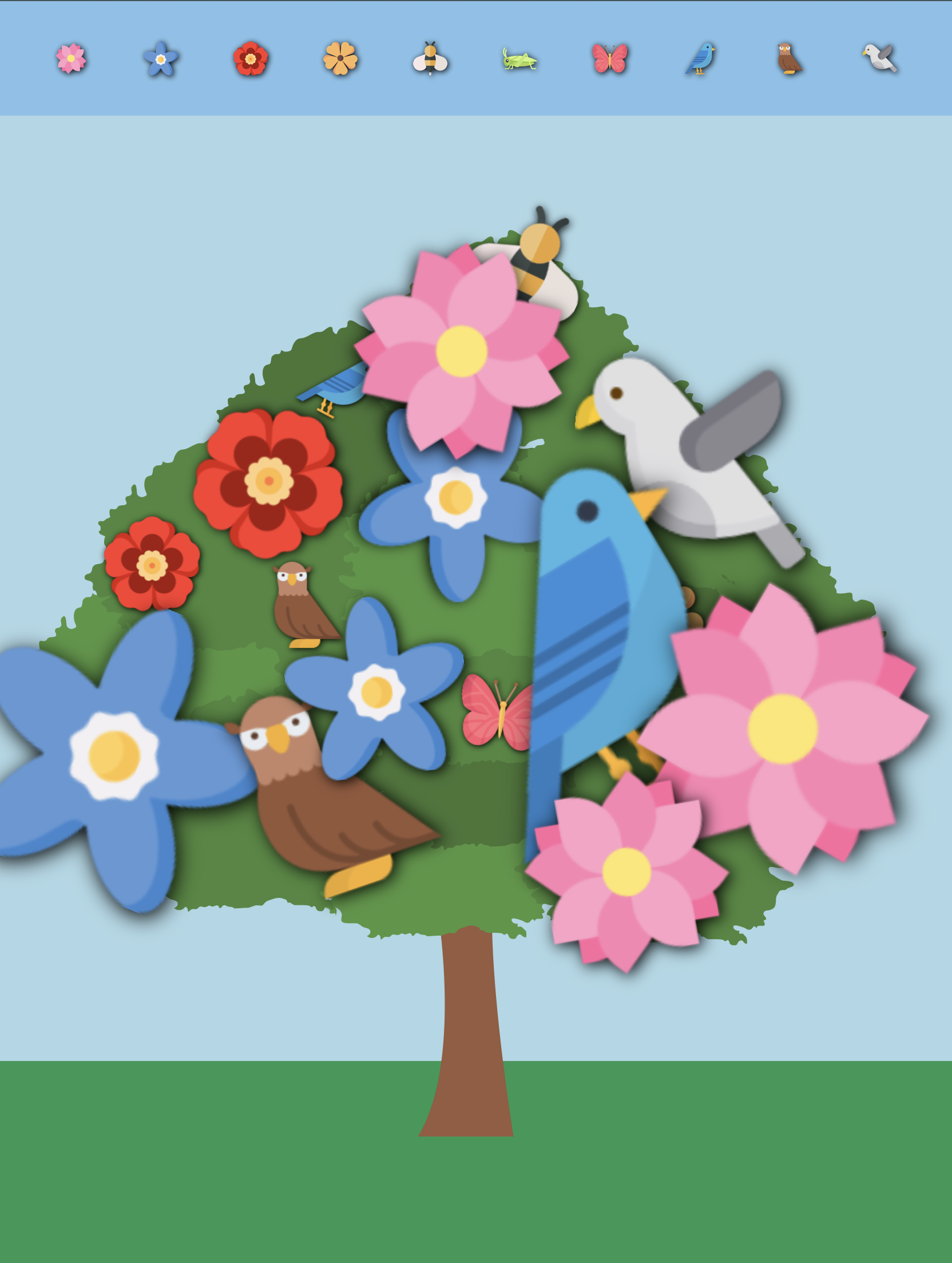
A scrapbook tool to keep calm with nature.
This tool is more convenient for phones. It works with touch moves.
A scrapbook tool to keep calm with nature.
This tool is more convenient for phones. It works with touch moves.


This tool is more convenient for phones. It works with touch moves.
For this assignment my goal was to create a polished finished product of my character creation tool. I wanted to improve my interface on spatial layout & visual design.

So, I wanted to stick with my idea of wardrobe but use visually more satisfying elements. What I’ve learned from my previous experience and from class talks is that the colors we choose and the compatibility of assets we use plays a huge role in the whole experiment. For me this time, it was important to use elements that match each other with colors, illustration type and style other than creating elements with texture like the previous one. I was going to either use only textured elements or elements with using Adobe Illustrator.
Other thing I realize was the multiplicity of assets we give the user to play with. More choice we give the user means more experimentation with the tool. My tool’s goal is to combine multiple clothes combination depending on weather so I thought people have different taste when it comes to fashion so why not giving them as much as assets that they feel it’s fashionable for them. What this means is the user finds something about them selves in these creation tools. They reflect themselves on these creation tools.
Other aspect I’ve changed in this mix&match tool was not just to be limited with a female or male, white or black character. So, even I didn’t put any body on the background the placement of clothes and the proximity of assets to each other were enough to get that experience of entirety.
In my previous tool, I’ve prefer to arrange the buttons depending on the alignment of a body. So I was actually giving the user information about which button change which element without notice. So, they unintentionally knew the last button won’t change the hair but the shoes. This time, I notice them about which button change which element by creating the buttons themselves as an image.
After users create something with a mix&match tool , we shouldn’t forget they they might wanna keep their creation for themselves. Because, I believe we are just the developers and what they do with our tool is their creativity and their creation. So, Ive added a download button in case they want to keep a copy for themselves.


This weeks assignment was about designing an interface that allows the user to combine image layers in different ways and producing artworks. I’ve builded an interactive tool that you play with the layers like changing the clothes, hair etc. of a character. I’ve inspired from the paper dolls. Paper dolls are figures cut out of paper or thin card, with separate clothes, also made of paper, that are usually held onto the dolls by paper folding tabs. I remember them from my early ages they were appeared in magazines and newspapers.

I’ve created my asset folder with the png images I’ve created in Photoshop and illustrator. I didn’t pay too much attention to detail on my doll, basic idea was to make it fun. I wanted to use real textures on the clothes. I want to add more assets and features in the future to this project.
This app is coded in HTML/CSS and Javascript. You can reach the code from the link;


Adobe Illustrator

CodeSandBox
In real life there is no appearance modification station and in order to alter the way we are seen by the rest of the world we have to resolve to less flexible means. We can change our clothes, get tattoos or piercings. We can colour our hair, style it or choose to shave it. We can even go down a “body size” or two by changing our diet or going to the gym yet it’s pretty clear that our real life customization tools are far more limited than those in game. When we enter the virtual world of online gaming it is so easy to make the avatar representing us look however we want them to. So what lies behind the choices we make when we create these in game manifestations of ourselves?

For this week’s topic we are investigating the creative space of "character creator" applications. Character creation tools allow people to experiment with identity & enable a form of artistic collaboration between the artist and player. For this assignment, I mad characters in 4 different character creators.
As a person, who spent her childhood playing “The Sims“ It was so fun for me to explore all these nice tools. I believe there is no difference in having fun among the psychology of creating characters even it’s less detailed more realistic. My attitude was creating slightly idealized avatars based on my actual self. There must be a deep hole behind this behavior. I also believe as a woman, the creation of characters are related with our childhood. Girls are likely to play with dolls and inclined to create characters beautiful or good looking. What is it this impulse that direct us while creating this characters. What is the impulse of creating them more likely look like us? These questions made me think a lot.

#Nintendo

#Rat Maker

#Aloha Sushi

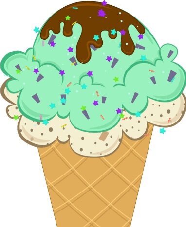
#Ice Cream Makers

With the mii creator you can customise everything about your character and create the perfect avatar - whether that's a boy or a girl. The Wii Mii maker allows you to choose from a wide variety of options for each facial feature. By the end of the design process you will have created a carbon copy of yourself or something completely different!
There’s a variety of options where you can choose “eyes” among more than 60 variations. You can customize twelve section of body including the width(weight) and height of your character.
For those who don’t know, Miis are customizable cartoon avatars that came into existence with the launch of the Nintendo Wii in 2006. Remember those big-headed characters that bopped around your screen in titles such as Wii Sports or Miitopia? Yup, those are the Miis.

Rat maker was so much fun even it doesn’t have detailed graphics as much as. Nintondo’s miis. The user face and fonts were look like 90’s infer face. Maybe this was the reason what makes it very special.
Altough there wasn’t a lot of options to choose from, they made a great job with the graphics. They looked like hand drawn illustrations and I think they’ve bring them together using photoshop.
Even it doesn’t require to much detailed work. They made a great job creating a tool that was so fun with all the elements in it, as a whole.
Here is another tool I’ve found during my research;

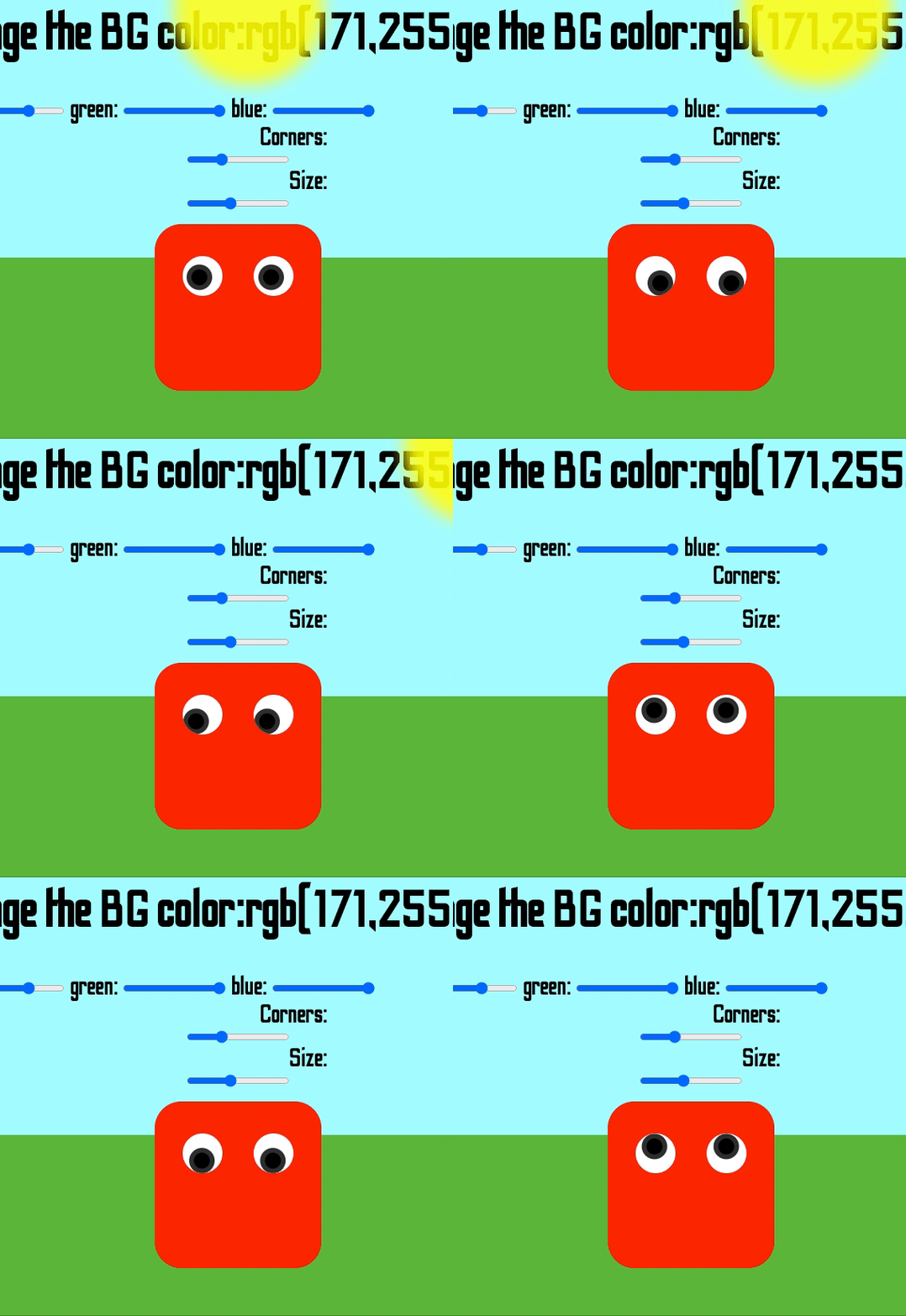
The theme of this week’s assignment is to create an input=”range” and to come up with a toy. While creating this toy I’ve been inspired by colorful cartoons from my childhood. My first three sliders change background color in R,G,B format. Then, I have radius and size which can change the shape of my character and the size of it. Lastly, I have 3 more slider on the left bottom corner which can change the ground color in HSL format. I always find playing with the colors, relaxing. But, i think in this sketch you’re able to play with them in two different structure. Red, Green, Blue and Hue, Saturation and Light. It’s exciting to see so many range and shades of colors there are.
I also wanted to give my character a living feature which is “the moving eyes”. So that, it makes you feel he’s following what you're doing in browser. I like to do these cartoonish sketches. They take me go back to my childhood “The Looney Tunes” times.

I believe it was a good idea to start with input=”range”, it taught me a lot in Javascript. While doing this sketch, I had to go back and look at eventListeners which helped me practice my knowledge in JS. Once again I understood how easy to code in P5. By the way, next time I’m planning to use SandBox.